Apple has recently rolled out the seventeenth iteration of the OS and with that, there have been a plethora of new and noteworthy features to the fore. Along the same lines, there have been a few UI/UX tweaks, some of which haven’t been welcomed by the users, such as the likes of a new default message tone and the removal of swipe to forward/rewind video. And now, there has been another entry to this list.
The New Grey Call Screen on iOS 17 is messed up!
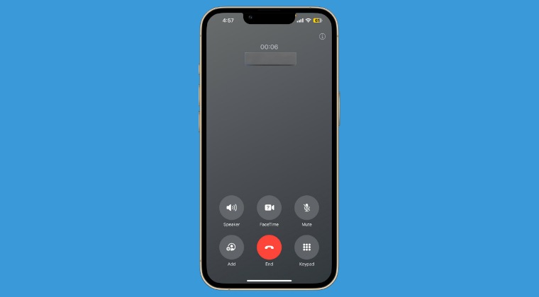
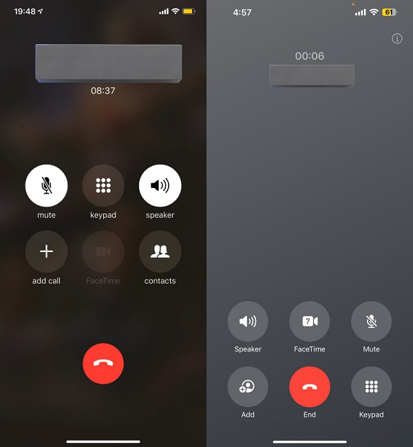
Numerous users have now voiced their displeasure over the new default grey call screen on iOS 17. They have tagged it as a dull and ugly interface with a lot of unnecessary empty space in the center. Apart from that, the layout of the buttons, especially Mute and Speakers have been interchanged, thereby making it all the more difficult for the users as they were used to the earlier button positioning. More so, what exactly Apple achieved by interchanging the button positioning is beyond anyone’s guess!
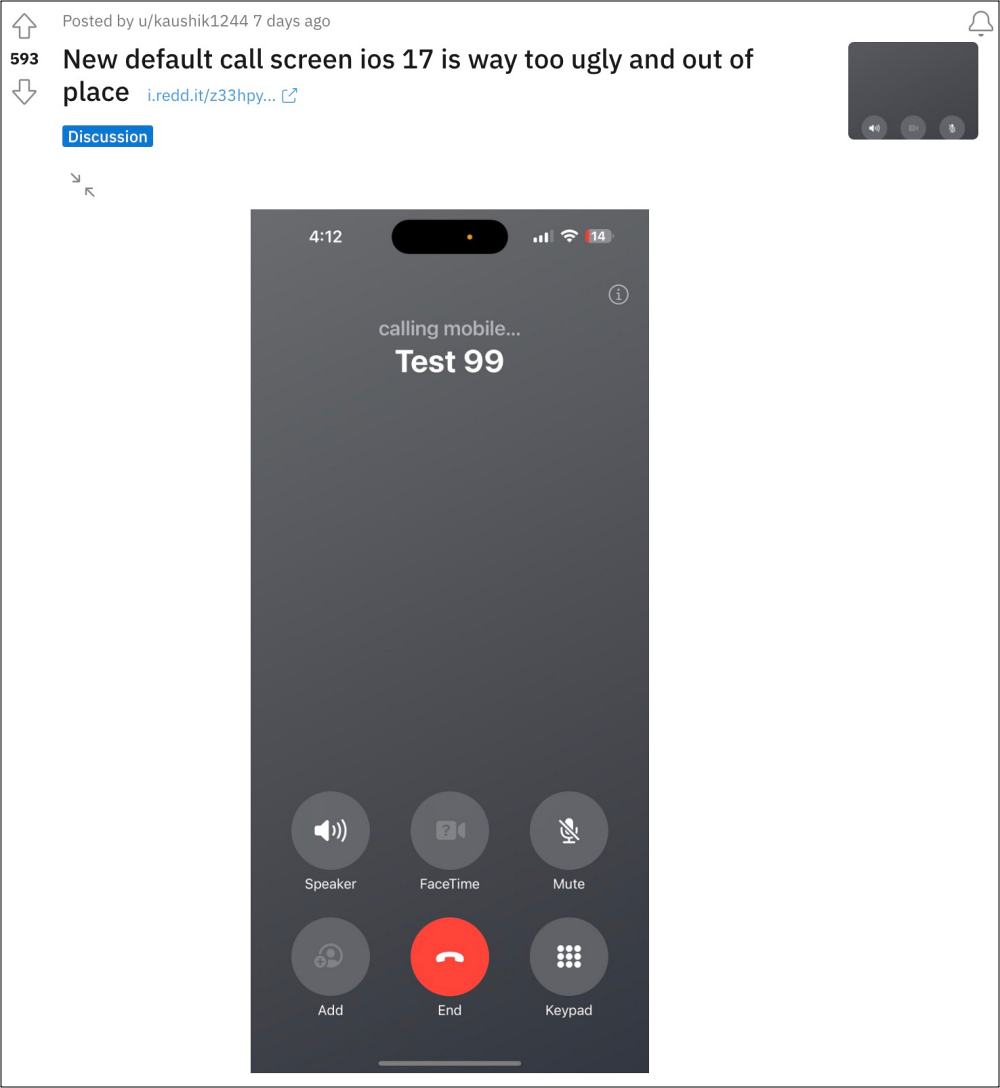
Likewise, the Cupertino giant has opted for a little bit more transparency in its UI this time around. So this gradient-filled call screen doesn’t seem to be in sync with the rest of the UI. To make matters worse, it tends to have worse visibility in sunlight than its previous iteration. Owing to all these reasons, one can clearly see why users hated this change. So could we do something to minimize its impact or rather ugliness? Let’s find out.
Is There Any Workaround? Yes and No!
As of now, the only workaround that might help you mitigate this issue is by applying contact photos to each of the contacts. However, for many users, that might not be the most viable or feasible approach [after all applying photos to over 00 contacts takes time!]. Apart from that, there is another glaring yet obvious issue: this workaround will not work out unknown numbers. So if you get a call from a contact that is not saved, then you would have to deal with the grey screen.
So on that note, we round off this guide regarding the new grey iOS 17 default call screen. What are your views on the same? Is it just a minor tweak and moreover, one usually just glances on this screen for a few seconds- so has this change been blown out of proportion? or is it something that will concern you? Do share your valuable opinions with us in the comments section below.